5 Things to A/B Test on your Magento Product Page to Double Conversion
It is the goal of every e-commerce owner to increase their conversion. One of the ways to do this is using A/B testing.
What is a/b testing?
A/B testing is the strategy used to test one or more parts of a website by creating two versions of the components to see which one converts more. As an e-commerce owner, you will want to test your product page. A/B testing your Magento product page makes it easy for you to learn more about what your customers likes and dislikes. You get to know what can be improved on your e-commerce store to double your conversion.
This article highlights 5 things you can A/B test on your Magento e-commerce store to increase your conversion.
Whether you are just starting your e-commerce store on Magento or you are searching for how to improve yourconversion rate, the tips below will help you achieve your goal.
1. A/B test your product headlines
The product headline is the first element your visitors sees on your product page. It is your value proposition and it must catch your customer's attention within 5 seconds. If your product title does not sell your products, then your customers will not engage further with your product page.
So, what can you test on your product headline?
- Test a keyword rich title with a standard product title: For example: Converge Elavon payment extension for Magento 2 vs. Converge Elavon
- Test different fonts and styles: Visual presentation of your headline is necessary to attract your visitors.
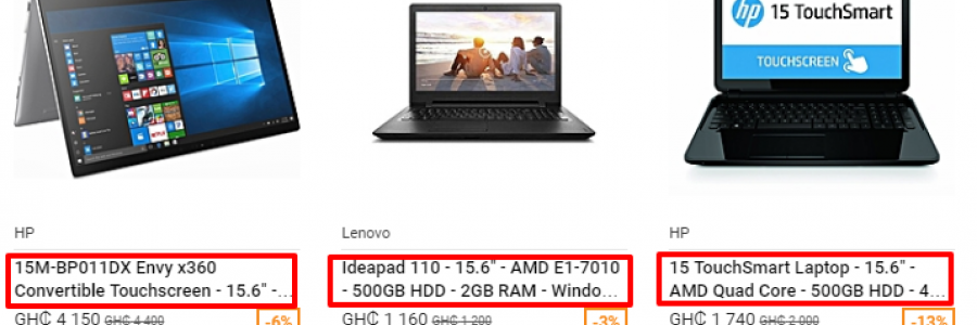
When you A/B test your headlines, it will help you understand your visitors more and what they need. For example, check out the product headlines of the laptop computers below:
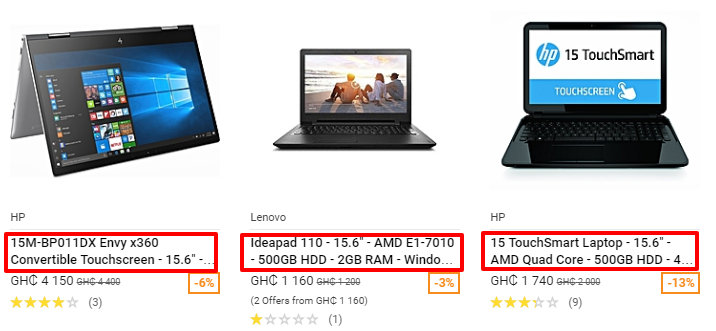
At a glance, you get to know the brand of the laptop computer, the size, the type of processor, etc. With this information, you can make an informed decision without reading the description.
2. Product descriptions
Product description is very important on your e-commerce store. It gives buyers the information they need about your product. It convinces them that the product is the right one for them. Therefore, your product description should show features, benefits, unique selling proposition and how to use the product. This will help your customers to make an informed decision.
So, what can you test on your product description page?
- Test long description vs short description.
- Test descriptions in a table vs text descriptions.
- Test plain text description vs. bulleted list.
One thing you should be careful with is copying contents. Don't copy product descriptions from one place to the other. Make sure it is unique. Google is moving websites that have duplicate content down the ranking page. Don't let your e-commerce store be one.
Check out the clear, specific and attractive product description of Converge Elavon payment extension below:
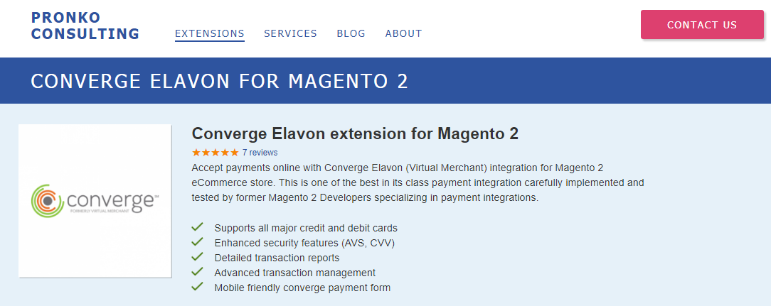
The description is clear with the major benefits highlighted in bullets.
3. Product images
It is easy to see the product you want to buy in a brick and mortar store. You can hold it and touch it. But, in e-commerce, you can only rely on product photos to make an informed decision. This is why product images are very important on ane-commerce store. It is easy for people to remember images than texts. In fact, the brain can remember about 2,000images with 90% accuracy within a week. Product images can attract, persuade, influence, motivate and direct the attention of your visitors and create memories in their minds.
This is why you need to A/B test your product images to see which one converts best. The followings are what you cantest on your product images:
- Test big product images vs. smaller images
- Test different images of the same product to see which one converts better
- Test white background images vs, real context images
- Test the position of the image i.e. top vs. left
- Test models vs mannequin
- One image of the product vs. two or images of the product on the page.
Check out the product image below:
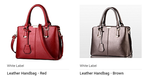
It shows two different colors of the same bag. You can use it to conduct an A/B test to know which color converts best.
4. Product badges
Customers can get lost while browsing different products on your e-commerce store. Adding product badges or stickers will help your products to stand out and also attract your visitors. It can also help your customers to make their decisions faster.
You can use the badges to show the unique selling point of the product. You can attach these badges to your product’s thumbnails on the category or browse pages. The badges you can test or use includes:
- New product badge
- Exclusive sale badge
- Bestseller badge
- Awarded product badge
- Hot product badge
- Featured product.
Most often than not, buyers have questions in their minds about whether they are buying authentic items. Addingguarantee or badges will help a great deal. This is necessary if you are selling luxury items. It helps your customers to trust you more. They will give you their credit card because your site is secure.
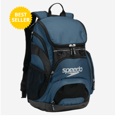
Below is a good of a product badge you can test out on your product page.
5. Clear call to action button on your product page
A well-designed and clear call to action button can increase your conversion rate. Google tested their call to action 50 times with different shades of blue to find the highest converting call to action color.
So, what can you test on your call to action button?
You can test the color variations. Some people say green and red color converts better, but that may not be true for everybody. There is no one color that is best until you A/B test it to know which colors on your call to action button create a strong contrast between your call to action button and the product page. Other A/B test you can carry out on your call to action are:
- The color of the font
- The button color
- The button shape
- The position of the button on the page.
However, the aim of the A/B test is to improve your conversion, so make sure it is noticeable wherever you put it. Below is an example of a “buy now” button positioned on the right-hand side of the product page.
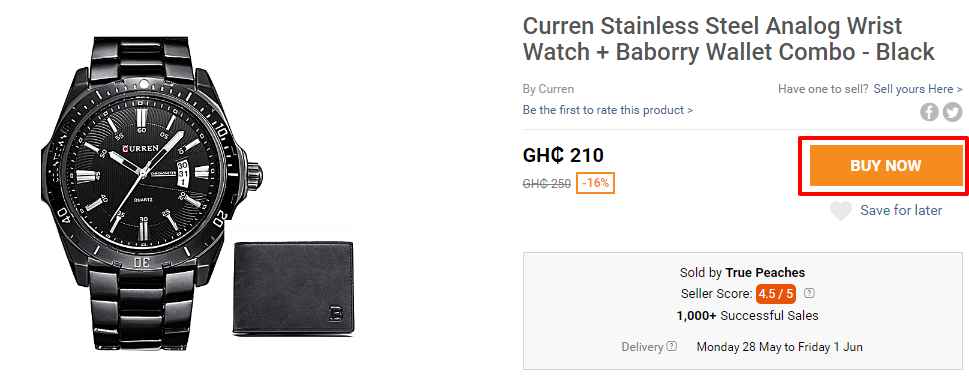
You can A/B test different colors (Red, Green, Blue) and different positions (left, right, top and bottom).
A/B testing is not a once and for all event, it is a continuous activity you must always carry out on your product page to increase your conversion rate.
